Handling Quality Control Flags and Adjusted Data
Jaimie Harbin (https://orcid.org/0000-0003-3774-3732), Dan Kelley (https://orcid.org/0000-0001-7808-5911) and Clark Richards (https://orcid.org/0000-0002-7833-206X)
2025-10-30
Source:vignettes/qc.Rmd
qc.RmdAbstract Argo floats data undergo a series of
testing procedures to assess the quality. In addition, some data sets
undergo adjustments that are made in recognition of the Quality Control
(QC) analysis or to employ information about improved calibrations, etc.
The creators of argoFloats therefore developed ways to deal
with QC flags and adjusted data. For quality control, this centers
around three functions: plot(which="QC"),
showQCTests()and applyQC(). Adjusted data are
handled with the useAdjusted() function.
How QC Flags are set
Core, biogeochemical (BGC), and Deep Argo data all undergo testing to ensure the data found at the Data Assembly Centers are as accurate as possible. This is done on both “real time” data and “delayed mode” data. As explained in the Argo User’s Manual (Carval et al. 2019), real time measurements are assigned a QC flag within a 24-48 hour time frame, and delayed mode are looked at by scientists who apply procedures to check the quality.
Handling Flags
As described in the Argo user’s manual (Carval et al. 2019), data that are given a flag value of 1, 2, 5, or 8 are considered ‘good’, those given a flag value of 9 are missing, and those given flags 3, 4, 6, and 7 are considered ‘bad’.
A useful parameter to familiarize with is the
dataStateIndicator. This tells the user the degree of
processing the data has passed through and can be helpful to determine
the validity of the data. argoFloats has incorporated a way
to subset by dataStateIndicator to allow the user to
analyze data with a specific degree of validity if they wish.
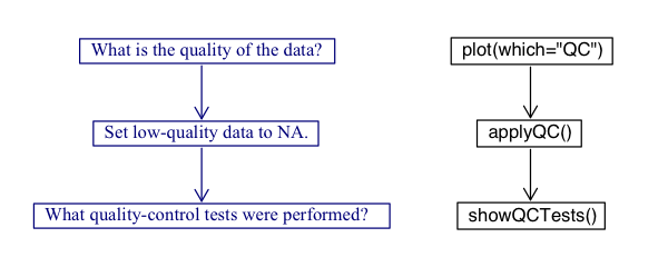
The argoFloats package, using the associated
oce package, has incorporated a 3-step process when
considering argo QC flags. The process encourages users to always
analyze the data they are considering, and acknowledges that the user
assumes all risk from their Argo data, as described in section 1.3 of
the Argo User’s Manual (Carval et al. 2019). The process is shown in the
following diagram.

This vignette will walk the users through the three step flag process
while demonstrating examples using the float with ID
1901584 near the Bahamas.
Making QC Plots
argoFloats uses the flags within profiles to distinguish
between “good” and “bad” data. It offers a specialized plot type that
displays the quality of data, with a two-panel plot that shows parameter
quality and parameter mean. This only works on objects that were created
by getProfiles(). The user must provide the
parameter of interest, but if this is not supplied, the
function will issue a message about the permitted parameters for the
dataset.
The following shows how to get the QC plot for
temperature for the float with ID equal to “1901584”.
library(argoFloats)
data("index")
index1 <- subset(index, ID="1901584")
profiles <- getProfiles(index1)
argos <- readProfiles(profiles)
plot(argos, which="QC", parameter="temperature")
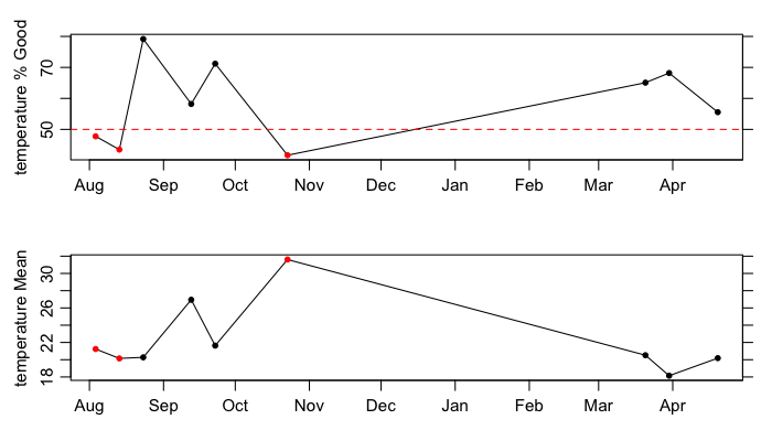
ID 1901584. The top panel shows the
percentage of good data within the individual cycles (or profiles), with
the dotted line and red dots indicating a threshold of at least 50
percent good data. The bottom panel shows the mean of those data that
are considered good.As shown, both “good” and “bad” data exist within this subsection of
the data recorded by float 1901584. For example, the first cycle is
marked as “bad” (since under 50 percent of its data are considered
good), as shown by the red dot. If the user had the desire to
investigate the QC performed on this data, the next step would be to use
the showQCTests function.
Exercise 1: Use the previous code to determine the
quality of temperature data for float ID 4900845 referred
to in the built-in synthetic index dataset. Explain your results.
Discovering which tests were performed
showQCTests prints a summary of the QC tests that were
performed on an Argo cycle. Caution: some datasets have flags,
indicating that QC procedures had been performed, even though the
metadata contains no indication of such procedures; this means that
showQCTests can sometimes suggest that no tests were done,
even though the evidence is that they had been done.
showQCTests uses hexToBits() to decode the
hexadecimal values that may be stored in historyQCTest.
From there it pairs the determined test values with the appropriate
actions, QC Tests performed or QC Tests failed, found in
historyAction within the metadata slot of an individual
Argo profile, as read directly with oce::read.argo() or
indirectly with readProfiles().
To analyze the first cycle shown by the
plot(..., which="QC") example, we will use previously
defined variables and the showQCTests() function as shown
below.
index2 <- subset(index1, cycle="124")
profiles2 <- getProfiles(index2)
argos2 <- readProfiles(profiles2)
showQCTests(argos2[[1]])
As shown by the output of this function,
Tests performed: 2 3 4 5 6 13 14 15 16 17 19
    Failed test 14 (Density Inversion test)
Test 14, the Density Inversion Test was failed, given in section 3.11 Reference table 11: QC test binary IDs of the Argo User’s Manual (Carval et al. 2019).
At this step, it is recommended that the user utilizes the Argo Quality Control Manual for CTD and Trajectory Data (Wong et al. 2020) to determine the criteria necessary to fail this test, and the action taken if this test is failed. This will help the user determine if they agree with the results or not. A good way of doing this is by using the following code to analyze the flags of specific parameters:
A <- argos[[1]]
D <- data.frame(T=A[["temperature"]], TF=A[["temperatureFlag"]],
                S=A[["salinity"]], SF=A[["salinityFlag"]],
                P=A[["pressure"]], PF=A[["pressureFlag"]])
Note that this particular test is based on potential density, so some further calculations will be required to check on the procedure. The procedure is not simple, and some study of the Argo documentation will be required of any user who wants to check on the procedures. Even then, a reasonable level of coding expertise would be required of anyone intending to alter the procedures. Proceed with caution!
Exercise 2: Use the first cycle of Argo float with
ID 4900845 in the synthetic dataset to determine which
tests were performed and/or failed during quality control testing.
Explain your results.
Applying QC flags
The applyQC() function examines QC within an
argoFloats object that was created by
readProfiles(). By default, it replaces all suspicious data
with NA values, so they will not appear in plots or be considered in
calculations. This is an important early step in processing, because
Argo floats commonly report data that are suspicious based on
statistical and physical measures.
If the user decides they are in agreement with the QC tests
performed, and solely want to work with the data that is considered
“good”, they can use the applyQC function to rid the “bad”
data. An example of where this could be useful is when looking at TS
diagrams as shown below:
clean <- applyQC(argos)
oldpar <- par(no.readonly=TRUE)
par(mfrow=c(1, 2))
plot(argos, which="TS")
plot(clean, which="TS")
par(oldpar)
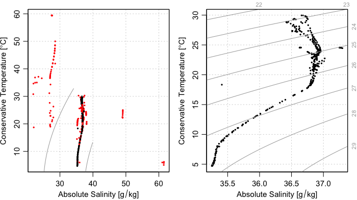
ID 1901584.Although Figure 3 provides a clear illustration of the need for QC
testing and the handling of QC flags, it also illustrates limitations,
for the plot on the right still contains several data points that are
far from the overall data cloud, and therefore very likely to be
erroneous A good step at this point might be to find the individual
cycles/profiles containing those stray points. This type of analysis can
be found at our Youtube page in video 08
(https://youtu.be/nN4xs0wCnB4) and video 09
(https://youtu.be/dYzEO5S2GBw).
Exercise 3 : Use applyQC() on float
with ID 4900845 from exercise 1 and plot comparing TS
diagrams. Do the plots look different? Use basic R functions to
determine if the data are different. Explain your results.
Using Adjusted Data
Preliminary note: the useAdjusted()
function requires that the version of oce be 1.3.0 or
higher. Therefore, the code provided in this section is wrapped in tests
of the version number, for otherwise the vignette would not build for
all users. It is likely that the CRAN version will be bumped to 1.3.0
sometime in the autumn of 2020, but until then, users will need to build
oce from source, using
remotes::install_github("dankelley/oce", ref="develop")Some data sets undergo adjustments that are made in recognition of
the Quality Control (QC) analysis or improved calibrations. These type
of data sets are considered “adjusted” and are handled using
useAdjusted(), provided that the version of
oce is 1.3.0 or higher (otherwise,
useAdjusted() will report an error). The procedure is that
the oce function preferAdjusted() is called on
each of the Argo objects stored within the first argument, which will
then cause future uses of the [[ accessor to return
adjusted versions of variables. It should be noted that the adjusted
versions are not always preferable (e.g. sometimes the adjusted values
are all NA), so useAdjusted() is a somewhat
sophisticated process, as is explained in its documentation.
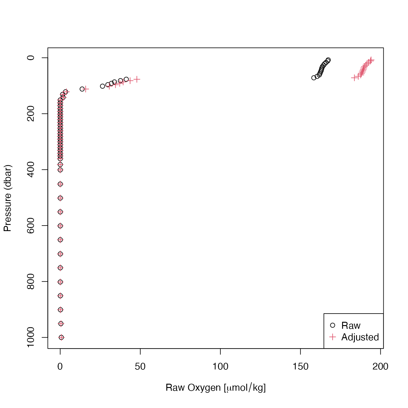
One example where it is useful to use adjusted data is when
considering oxygen. Often times, BGC sensors have calibration issues and
more specifically for oxygen optodes, floats can initially read low
compared to climatology. In the example below we used the built in data
set, named SD5903586_001.nc, to focus on the oxygen in the first cycle
with float ID 5903586 in the synthetic data.
if (packageVersion("oce") > "1.2.0") {
    library(argoFloats)
    raw <- readProfiles(system.file("extdata", "SD5903586_001.nc", package="argoFloats"))
    adjusted <- useAdjusted(raw)
    rawOxygen <- unlist(raw[["oxygen"]])
    rawPressure <- unlist(raw[["pressure"]])
    adjustedOxygen <- unlist(adjusted[["oxygen"]])
    adjustedPressure <- unlist(adjusted[["pressure"]])
    xlim <- range(c(rawOxygen, adjustedOxygen), na.rm=TRUE)
    plot(rawOxygen, rawPressure,
         pch=1, col=1,
         xlim=xlim, ylim=rev(range(rawPressure, na.rm=TRUE)),
         xlab=expression("Raw Oxygen ["*mu*mol/kg*"]"),
         ylab="Pressure (dbar)")
    points(adjustedOxygen, adjustedPressure,
           pch=3, col=2)
    legend("bottomright", pch=c(1,3), col=c(1,2), c("Raw", "Adjusted"))
}
Figure 5. Comparison of raw and adjusted oxygen profiles for
built-in float file SD5903586_001.nc.
As displayed by the plot, there are differences between raw and adjusted data. To determine if these differences are statistically different, basic R functions can be used as shown below:
if (packageVersion("oce") > "1.2.0") {
    plot(rawOxygen, adjustedOxygen,
         xlab=expression("Raw Oxygen ["*mu*mol/kg*"]"),
         ylab=expression("Adjusted Oxygen ["*mu*mol/kg*"]"))
    abline(0, 1, lty=3)
    model <- lm(adjustedOxygen ~ rawOxygen)
    abline(model, col=2)
}
Figure 6. Comparison of raw and adjusted oxygen for built-in
float file SD5903586_001.nc. The dotted line is a 1:1
relationship, and the red line is the result of linear regression (see
text).
An examination of the linear fit,
if (packageVersion("oce") > "1.2.0") {
    summary(model)
}
#>
#> Call:
#> lm(formula = adjustedOxygen ~ rawOxygen)
#>
#> Residuals:
#>        Min         1Q     Median         3Q        Max
#> -5.915e-06 -1.243e-07 -1.228e-07 -1.126e-07  8.117e-06
#>
#> Coefficients:
#>              Estimate Std. Error   t value Pr(>|t|)
#> (Intercept) 1.233e-07  2.982e-07 4.140e-01    0.681
#> rawOxygen   1.160e+00  3.741e-09 3.101e+08   <2e-16 ***
#> ---
#> Signif. codes:  0 '***' 0.001 '**' 0.01 '*' 0.05 '.' 0.1 ' ' 1
#>
#> Residual standard error: 1.965e-06 on 58 degrees of freedom
#>   (488 observations deleted due to missingness)
#> Multiple R-squared:      1,  Adjusted R-squared:      1
#> F-statistic: 9.614e+16 on 1 and 58 DF,  p-value: < 2.2e-16
reveals that the adjustment involved a simple scaling, in which the oxygen value was increased by 16 percent.
Exercise 4 Use the same ID and cycle as
the previous example to determine if there is a statistically
significant difference between raw and adjusted datasets for chlorophyll
A.
Answers
Exercise 1: Use the previous code to determine the
quality of temperature data for float ID 4900845 referred
to in the built-in synthetic index dataset. Explain your results.
library(argoFloats)
data("indexSynthetic")
index1 <- subset(indexSynthetic, ID="4900845")
profiles <- getProfiles(index1)
argos <- readProfiles(profiles)
plot(argos, which="QC", parameter="temperature")
As shown in the plot, 100% of the temperature data for float
ID 4900845 in the built in synthetic dataset are considered
“good”. This implies to the user that all data is considered okay to
use.
Exercise 2: Use the first cycle of Argo float with
ID 4900845 in the synthetic dataset to determine which
tests were performed and/or failed during quality control testing.
Explain your results.
library(argoFloats)
data("indexSynthetic")
index1 <- subset(indexSynthetic, ID="4900845")
profiles <- getProfiles(index1)
argos <- readProfiles(profiles)
a1 <- argos[[1]]
showQCTests(a1)
As shown by the showQCTests() function,
historyAction is not present in the metadata for this
cycle, so no report can be given. This is a case where the user must
self analyze their data to ensure all data seems reasonable to use.
Exercise 3 : Use applyQC() on float
with ID 4900845 from exercise 1 and plot comparing TS
diagrams. Do the plots look different? Use basic R functions to
determine if the data are different. Explain your results.
library(argoFloats)
# Contrast TS diagrams for raw and flag-handled data
data(indexSynthetic)
index1 <- subset(indexSynthetic, ID="4900845")
argos <- readProfiles(getProfiles(index1))
clean <- applyQC(argos)
oldpar <- par(no.readonly=TRUE)
par(mfrow=c(1, 2))
plot(argos, which="TS")
plot(clean, which="TS")
par(oldpar)
As shown by the plot, the plot containing “good” data and the plot containing “bad” data look the same. Using basic R functions as follows verifies that the datasets are the same.
summary(unlist(argos[["temperature"]]))
summary(unlist(clean[["temperature"]]))
summary(unlist(argos[["salinity"]]))
summary(unlist(clean[["salinity"]]))
This indicates no “bad” data were taken away, and it is up to the user to determine the validity of the data.
Exercise 4 Use the same ID and cycle as
the previous example to determine if there is a statistically
significant difference between raw and adjusted datasets for chlorophyll
A.
To plot the profile of chlorophyll A for float ID
5903586, cycle = 001, the following code is used:
library(argoFloats)
raw <- readProfiles(system.file("extdata", "SD5903586_001.nc", package="argoFloats"))
adjusted <- useAdjusted(raw)
rawC <- unlist(raw[["chlorophyllA"]])
rawPressure <- unlist(raw[["pressure"]])
adjustedC <- unlist(adjusted[["chlorophyllA"]])
adjustedPressure <- unlist(adjusted[["pressure"]])
plot(rawC, rawPressure, ylim=rev(range(rawPressure, na.rm=TRUE)), pch=16, col="blue", xlab=expression("Raw Chlorophyll A (mg/m3)"), ylab="Pressure (dbar)")
points(adjustedC, adjustedPressure, ylim=rev(range(unlist(adjusted[["pressure"]]), na.rm=TRUE)), pch=16, col="red")
legend("bottomright", col=c("blue","red"), c("Raw", "Adjusted"), pch=c(16, 16))
Using basic R functions to determine if the raw and adjusted datasets are significantly different is as follows:
plot(rawC, adjustedC,
     xlab=expression("Raw Chlorophyll (mg/m3)"),
     ylab=expression("Adjusted Chlorophyll (mg/m3)"))
abline(0, 1, lty=3)
model <- lm(adjustedC ~ rawC)
abline(model, col=2)
summary(model)
With the output being showing a p value of < 2.2e-16 indicating that the datasets are statistically different.
References
Carval, Thierry, Bob Keeley, Yasushi Takatsuki, Takashi Yoshida, Stephen Loch, Claudia Schmid, and Roger Goldsmith. Argo User’s Manual V3.3. Ifremer, 2019.
Wong, Annie, Robert Keeley, Thierry Carval, and Argo Data Management Team. “Argo Quality Control Manual for CTD and Trajectory Data,” January 1, 2020.
https://archimer.ifremer.fr/doc/00228/33951/